Wheat Moves Up (limited edition)
$ 150.00
$ 250.00
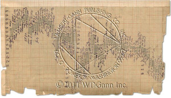
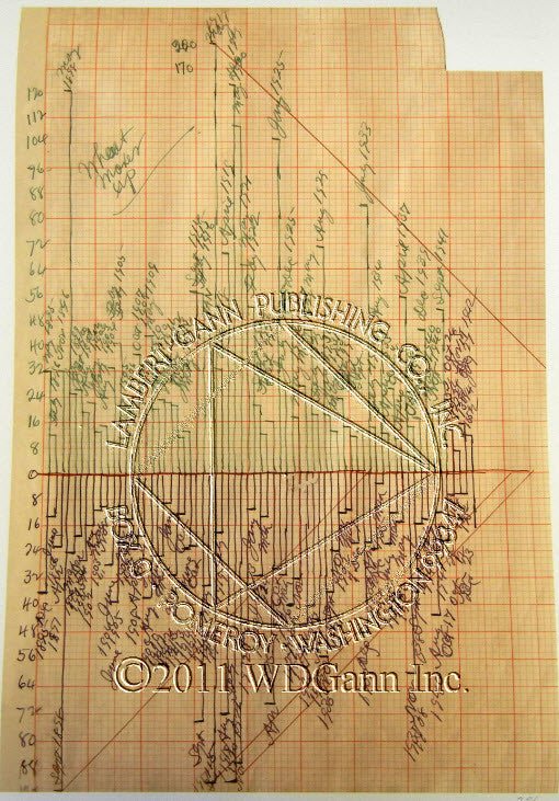
Here is one of W.D. Gann's studies in Wheat. There is a series of this type of chart for each commodity. Gann called these his Price Balance Charts.
The green lines above the "0" show moves up from lows. The purple lines down from "0" show the amount of decline from highs.
This is a clever, visual image of the shape and cycles of the market over a 50 year period. It is a yearly bar chart showing the swing moves up and down each year from a static baseline.
Those of you seaching for major highs and lows way back to 1895 will find them here.
Angles are drawn from the major highs and lows pointing to other years in the future. This is a chart that can easily be brought to current for your own studies.
This chart was used for the forecasts W.D. Gann made in the Commodity Trader's Bible, "How to Make Profits in Commodities".
Only 76 of this print, "Wheat Moves Up" will ever be made.